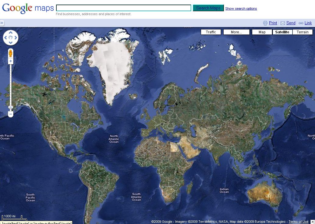
Whats wrong with this picture
- Details
- Category: Hvorfor
- Created: Sunday, 24 January 2010 04:11
- Written by Nylonmanden
 Google Maps / Google Earth
Picture is kindly borrowed from Google Inc. for Educational purpose.
So what is wrong with this picture?
Can you see it?
Could it be the strange size of Greenland and Africa?

maps.google.com
Other has it, that Africa is 30 million km2 and Greenland is 2 million km2.
Like Wikipedia:
http://en.wikipedia.org/wiki/Greenland
http://en.wikipedia.org/wiki/Africa
How did it come to look like that on google maps?
Africa shold have been 15 times larger than Greenland. It beats my eyes.
kindly
Nylonmanden


Comments
And i just noticed that the downloadable version "Google Earth" actually has the round version of earth and not the flat version as maps.google.com are using.
Camera position, i don't think so! They must be using the same data as in Google Earth.
3d sphere on 2d paper? This is a computer animation made to look 2d from 3d, no paper involved, and it's just very poor in quality conversion from "3d" to 2d, why not keep it as a sphere as they had it in their online beta version of Google Earth, now the online version is called Google Maps and it is a flat sketch.
It's not just GooGooGooogle. Many maps are funny made, even with the use of satellite "photo".
Here is an animation from google earth
http://earth.google.com/tour.html#v=10
It can also give some hint to how 9/11 event was "filmed".
Why use satellite photos in the first place, when they are so bad that the military are not using photos from satellites - Or - Why do they then have the Open Sky Treaty? Photographing other countries from aircraft.
Could it be about atmospheric refraction?